Flower Power. Watercolor and Sharpie. 2018. For this piece I wanted all the focus to be on one thing instead of many. When I started painting the middle flower, I decided it would be interesting if I added flowers next to it that would be fading in color to add more attention to the center flower. I chose to this on a large scale as well to make it something to you could see from across a room. After I finished the flowers, I used black sharpie and added thick and thin lines going into the center flower to make it look as if the center flower is popping off the page.
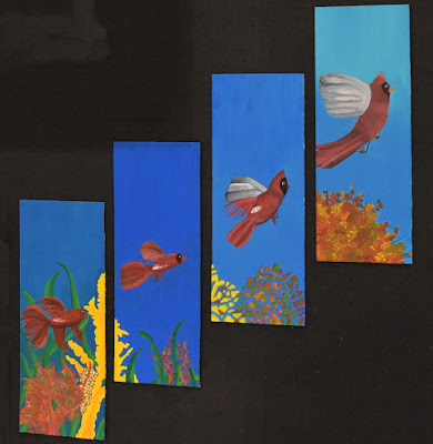
Sea to Sky. Acrylic Paint. 2018. In this transition painting I wanted the viewer to be able to see the similarities and differences among different life sources. I also wanted to pick two animals that are on opposite ends of the spectrum. With the fish being low in the sea and the bird being high in the sky. I also chose to do the same colors for the bird and the fish to make it more realistic as if they were really morphing into one another. I chose to add in background objects to make it more eye catching and realistic as well. I wanted the scenery in the first panel to break down along with the fish and bird and turn into what would be the tree in the last painting. The point of this piece is to make the viewer's eyes flow from the bottom to top and to sell the resemblance in life forms.
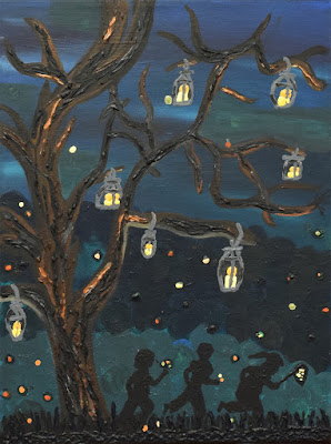
Living Lights. Acrylic Paint. 2017. In this painting, I wanted to depict a scene from my childhood. Going out and catching fireflies with my brothers was the usual summer night for us. I chose to do this painting because I wanted to take the viewer back to their childhood. I want them to remember the fun times they would have as kids. The sense of being care free, the laughter, the bumps and bruises, and the all around happiness. I wanted to use dark greens and blues to depict the perfect summer night. I would layer the paint on to give the painting life and dimension. I wanted the viewer to be able to walk around the painting and see something new that would jump out at them. I also layered the paint to make the candle and flame. This gives the painting more of a warm feel with the dark blues and greens for the background. I want this painting to take the viewers back to a happy place in time.


Comments
Post a Comment