Posts

Showing posts from May, 2018
Image
Flower Power. Watercolor and Sharpie. 2018. For this piece I wanted all the focus to be on one thing instead of many. When I started painting the middle flower, I decided it would be interesting if I added flowers next to it that would be fading in color to add more attention to the center flower. I chose to this on a large scale as well to make it something to you could see from across a room. After I finished the flowers, I used black sharpie and added thick and thin lines going into the center flower to make it look as if the center flower is popping off the page.
Image
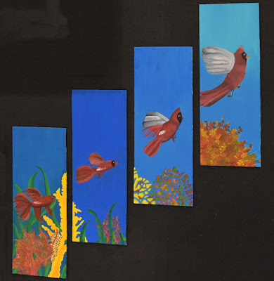
Sea  to Sky. Acrylic Paint. 2018.  In this transition painting I wanted the viewer to be able to see the similarities and differences among different life sources. I also wanted to pick two animals that are on opposite ends of the spectrum. With the fish being low in the sea and the bird being high in the sky. I also chose to do the same colors for the bird and the fish to make it more realistic as if they were really morphing into one another. I chose to add in background objects to make it more eye catching and realistic as well. I wanted the scenery in the first panel to break down along with the fish and bird and turn into what would be the tree in the last painting. The point of this piece is to make the viewer's eyes flow from the bottom to top and to sell the resemblance in life forms.
Image
Green and Yellow. Mixed Media. 2018.
Image
Cherries Will Bloom. White Earthenware Clay. 2017. This piece was one of my personal favorites to make. When I started to build this I decided that I was going to carve away lines into the piece to give it depth. After I got the lines carved, they resembled vines to me. I went with the idea of vines and something that would grow on them. When I added some round pieces of clay onto the rim of the piece, they looked like some sort of berry. I then added a decorative handle and thin lines going down the side to add more of a vine effect. When I finished placing the dots around the piece in no specific order, I decided that when it was fired I would be glazing the vines green and the dots red to look like cherries. I decided on the title because the  cherries did not appear fully bloomed but as if they were still awaiting to do so.  
Image
Flower. Monotype Print. 2017